Design + brandingGetting VG fit for the future
The client
Established in 1982, VG is one of Jersey’s largest, independent and privately-owned providers of trust, corporate and fund administration solutions.
Our approach
Having developed the visual language for VG in its earlier form, we were fortunate enough to be asked to refresh this once again to better reflect the dynamism and step-change within the business, celebrate the heritage of the brand as it approaches a milestone anniversary and simplify the visual and verbal articulation of its client proposition.
The solution
With the name "VG" established in core markets, two key needs shaped the direction of the new visual language: a broadened solution offering to an increasingly financially-sophisticated client base; and an ongoing necessity to attract and retain talent as a dynamic, professional and inspiring place to work.
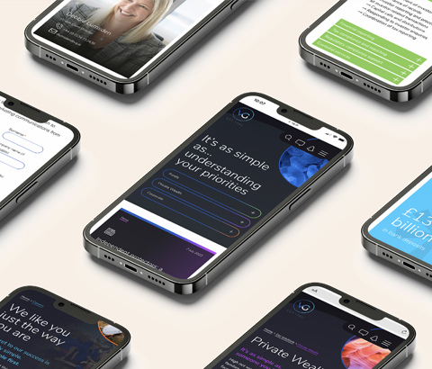
A richer, more mature core colour was agreed upon, accented with bright highlights specific to the types of client and similarly colourful abstract images based upon themes of connection and structure – appropriate given the types of work undertaken by VG for its clients.
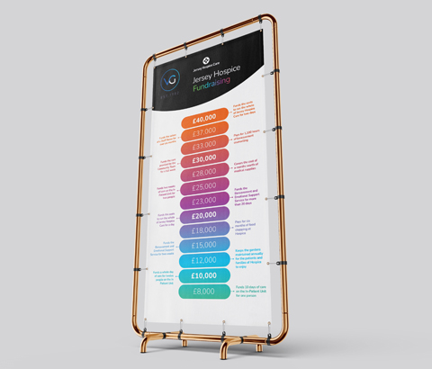
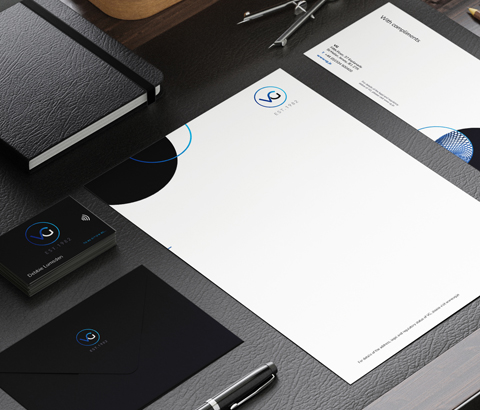
The new visual language was then applied across a wide range of marketing collateral which we have developed over the years, from signage to merchandise, print to digital.
www.vg.je